

The 2017 Pantone Color of the Year...
/
pinterest...
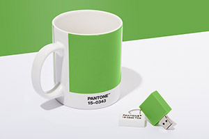
So, Pantone recently announced their Color of the year for 2017. The color, as you may have guessed from the photo, is Greenery. According to Pantone's website, "Green is nature's neutral...a life affirming shade. "
Are you wondering what the color of the year is...and who or what is Pantone? Pantone describes their color of the year this way:
A symbolic color selection; a color snapshot of what we see taking place in our global culture that serves as an expression of a mood and an attitude.
As for Pantone, a website called Co.design describes it this way:
Back in the early 1960s, Pantone was a printing company in Carlstadt, New Jersey, with a specialty in color charts for the cosmetic, fashion, and medical industries. Lawrence Herbert joined the company in 1956 and noticed how difficult it was for designers, ad agencies, and printers to communicate—identifying exact colors from names alone is tough. For example, there are red-based purples and blue-based purples, warm and cool shades, lighter and darker tones. Mistakes happened, there were tons of inefficiencies due to reprints, and Herbert knew there had to be a better way to do things. He bought Pantone in 1962 and launched the first PMS guide in 1963 with 10 colors in an effort to reduce the number of variables happening in the printing process. Creating an objective, numeric language means that any printer anywhere in the world can accurately produce a color.
If you've ever had to order business cards or done any printing, you may be familiar with the Pantone color system. It's wonderful to know that once you pick out your colors and the Pantone number, you can print your cards anywhere and the colors will look the same. But for the interior design world, the Pantone color of the year actually influences or creates trends in furniture, fabrics, paint colors, and even fashion.
To be honest, the Pantone color of the year has never influenced my taste very much. But since those color trends can begin a big shift in design, I have to pay attention. Some of us can remember the orange and avocado green of the 70's, the mauve and country blue of the 80's, the chartreuse and teal of the 90's, and the greys, taupes, and white of the 2000's. As a rule of thumb, I've heard that most color trends last about seven years, but I have to say this grey and taupe trend has been around for longer than that. This makes sense, though, because these are such neutral colors and really don't get old. You can always brighten these neutral tones with pops of color that make them feel fresh and current.
So, if green is the 2017 color, how could you use this in your home? Here are some ideas from pictures I snagged from pinterest.
A green kitchen island...

A green bath vanity...

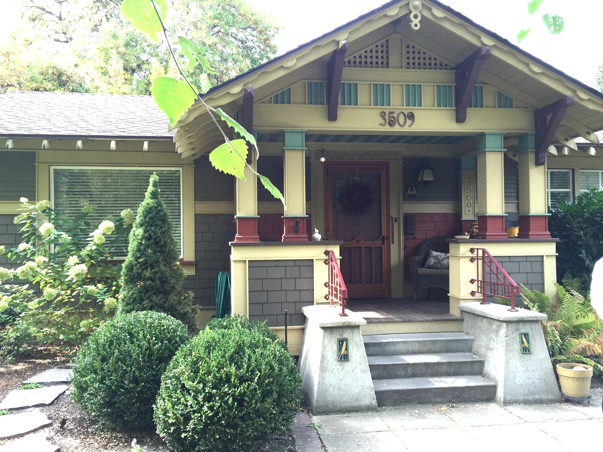
A green painted room...

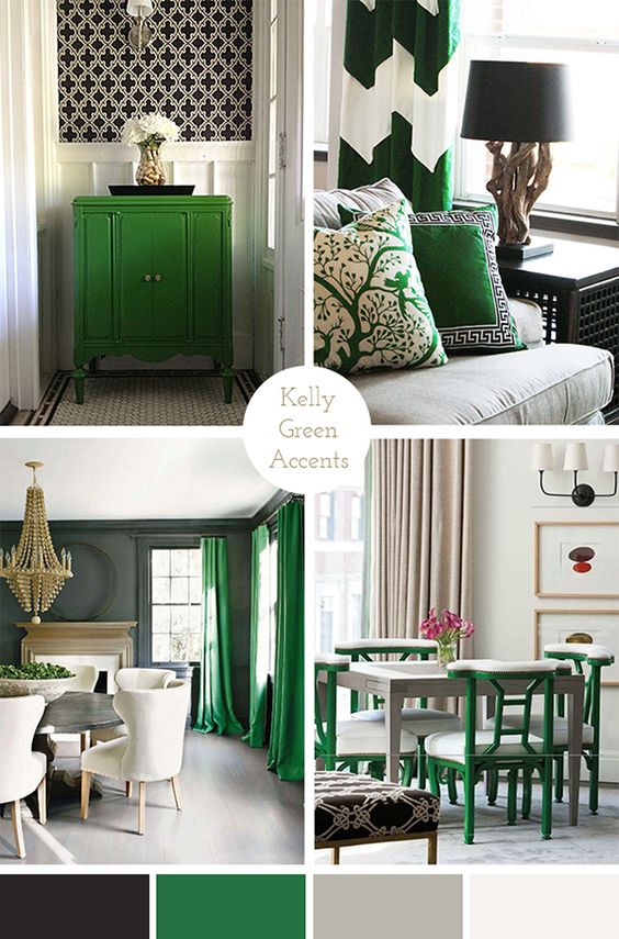
Green drapes or a green chair...

A few other ways to introduce pops of green in your home are shown here...a green chest, green pillows (my favorite way to introduce a color!), and painted dining chairs...
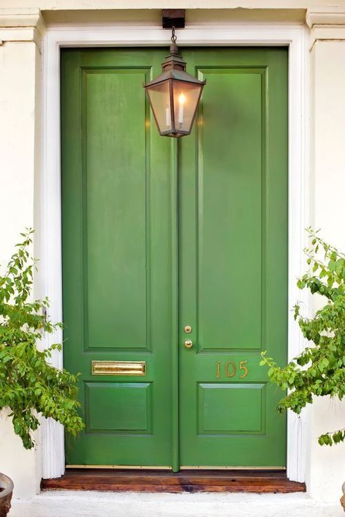
Love this green door...

Or maybe, just purchase some green bath towels or bath rugs that freshen up a white or grey bathroom...


Of course, the easiest way to introduce green in your home for a fresh new vibe is through a nice houseplant...as Pantone said, Green is Nature's neutral.


And, you can always add a fun little pop of green in your wardrobe...
A cute green jacket...

A fun new green bag...

Or a fun pair of Chuck Taylor tennis shoes...

I would love to hear from you if you decide to purchase or add something green to your home or your wardrobe this year. Not sure what I will do but I'm liking the idea of green somewhere...at least a new houseplant. I love how white and green look together! We here in the Northwest are surrounded by so much green from our beautiful evergreen trees so we do get to enjoy this color year round. Do you have any green in your home? Are you a fan of green? Would love to hear from you!
Warmly, Gracia